Basics > Tables > Correlation
How correlated are the variables in the data?
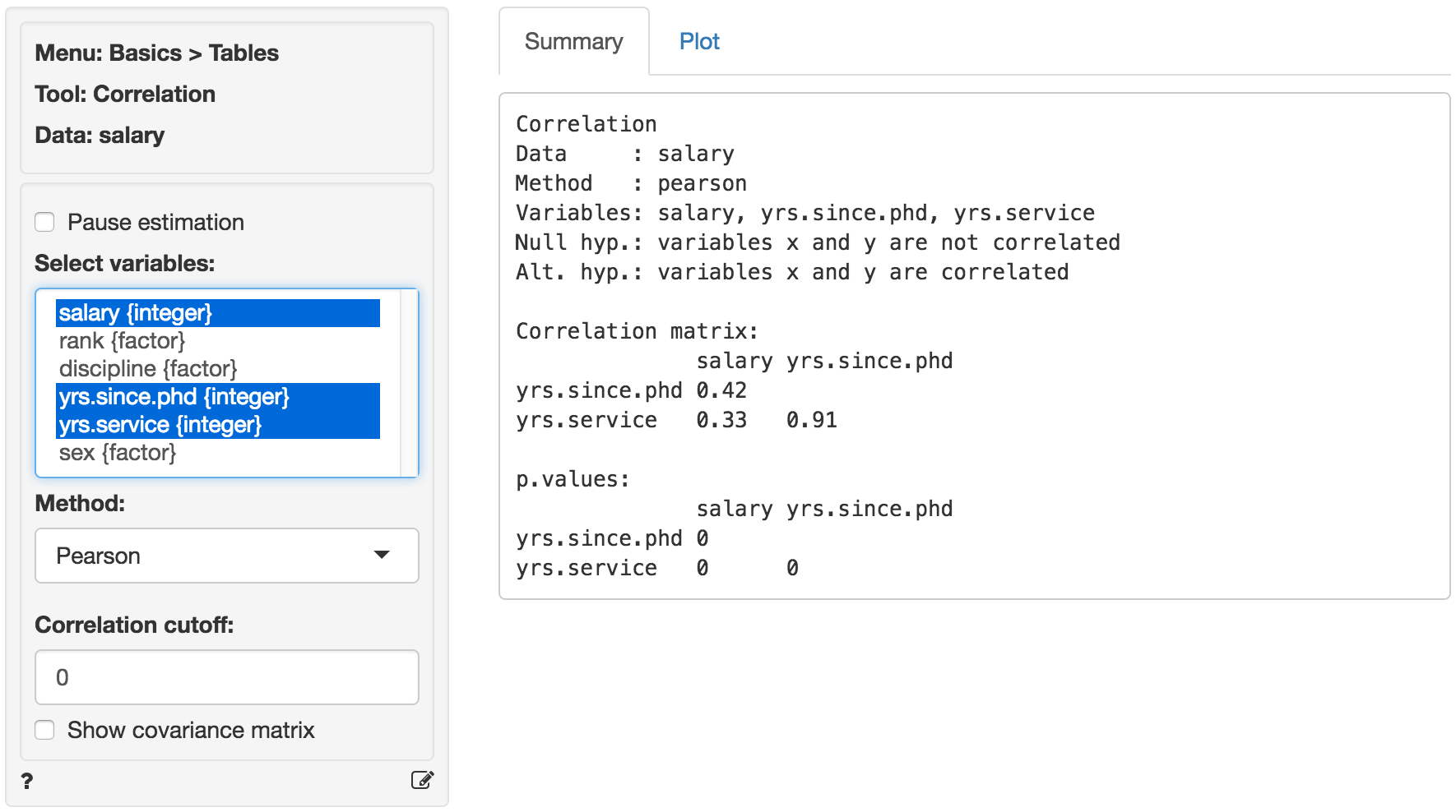
Create a correlation matrix of the selected variables. Correlations and p.values are provided for each variable pair. To show only those correlations above a certain (absolute) level, use the correlation cutoff box.
A visual representation of the correlation matrix is provided in the Plot tab.
Stars shown in the Plot tab are interpreted as:
- p.value between 0 and 0.001: ***
- p.value between 0.001 and 0.01: **
- p.value between 0.01 and 0.05: *
- p.value between 0.05 and 0.1: .
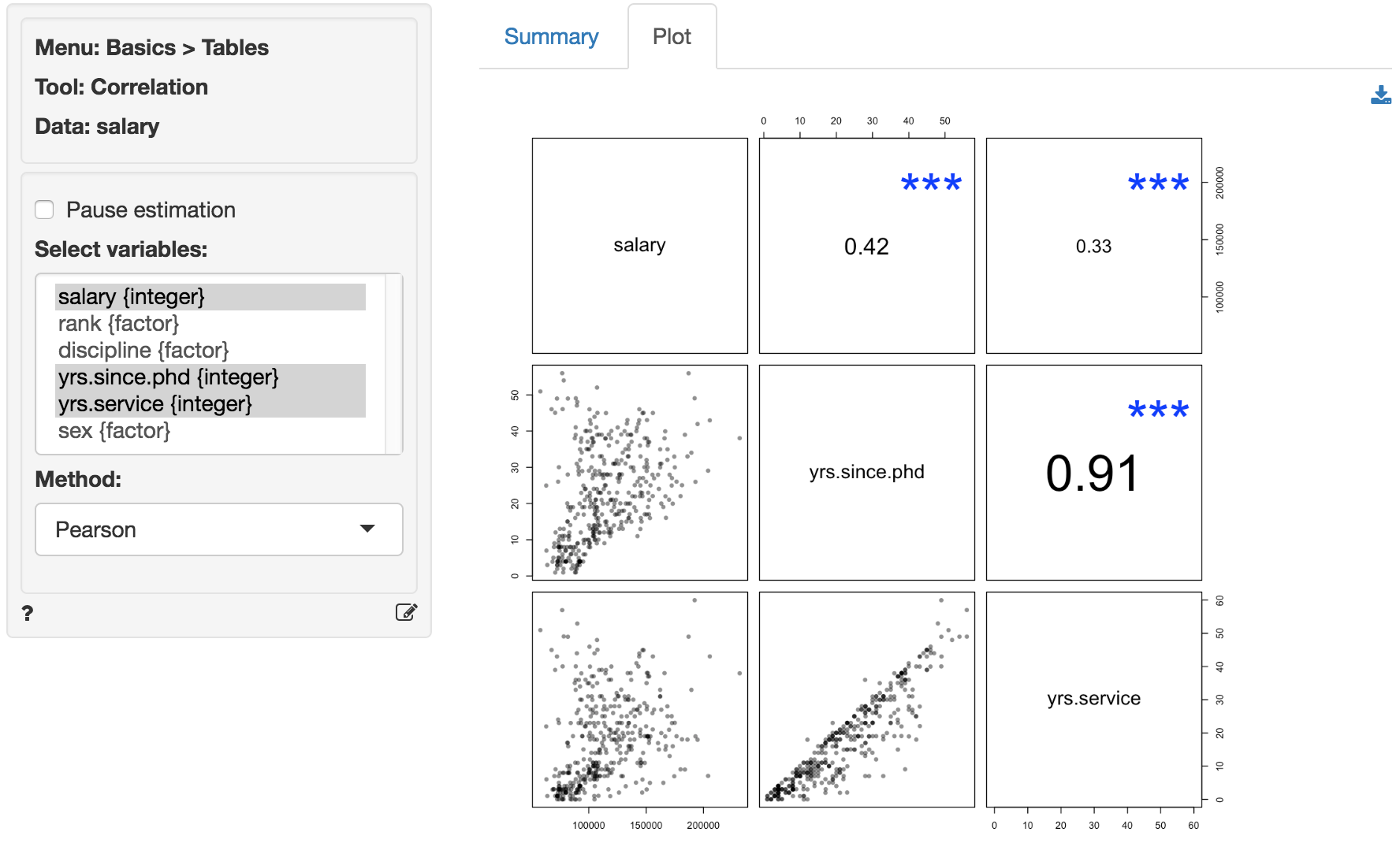
The font-size used in the plot is proportional to the size and significance of the correlation between two variables.
Method
Select the method to use to calculate correlations. The most common method is Pearson. See Wikipedia for details.
Correlation cutoff
To show only correlations above a certain value choose a non-zero value in the numeric input between 0 and 1 (e.g., 0.15).
Covariance matrix
Although we generally prefer to see the correlation matrix, you can also see the covariance matrix by checking the Show covariance matrix box.
Pause estimation
For larger datasets it can useful to click Pause estimation before selecting variables, entering filters, correlation cutoffs, etc. When you are ready to generate the correlation matrix or correlation plot make sure that Pause estimation is not checked. When Pause estimation is not checked, any changes to the inputs will automatically result in a new matrix and/or plot.
Khan on correlation
